6 Best Places to use email opt-in forms for maximum conversions
What is the difference between the first and second example? 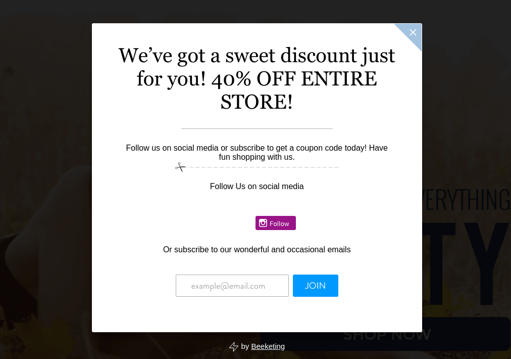 And number 2:
  Maybe, you will notice something in the design, maybe in the text, but the truth is lying in conversions. Relying on our experience, we sure that the first example will have much more submitted forms than the second. Why? The case is in opt-in. This article will take you through the entire process from capturing the best places for submitting a form using to design tips. But before we get started, here is some reasons why the email list is important for your business:
- In 2016 email marketing was the dominant marketing channel
- On average, It has $44 ROI
- Drives 174% more conversions than social media
- An email campaign has 6x bigger CTR than a tweet
- Email subscribers are 3 times more likely to share your content via social media than visitors from other sources
So, collecting and expand your email base should be the priority number one, but it is not easy. Today, we will show you the TOP 6 best places for using signup forms on your website.
Popup
 Popup signing forms are one the most controversial option in our rank. Nevertheless, it is still remaining as one of the best ways to get a user email, just because he cannot miss the form. Moreover, the recent statistics show that pop-ups are really working:
- Have a higher CTR than other kinds of ads (often around 2%)
- Entrepreneur.com increased subscriptions 86% and sales 162% after implementing pop-ups
- Nikki McGonigal, a food craft blogger, tested that lightbox drive 1375% more subscribers
In fact, the history knows many such examples. Therefore, all depends on how, when and where you use popups. The most working hints are:
- Show lightbox after 5-sec user browsing your site
- Add animation effects
- Include a unique offer or discount
- Display a pop up based on interest.
One of the special pop up forms is an exit-intent popup, which appears when a user exit the page. It easily captures the attention and gives you the last chance to convenience visitors to sign up.  If you decide to test and add a lightbox to your site, use a Supsystic Popup plugin. Let’s create together your first popup. Firstly, you need to create a new popup, enter its name and choose the template. Notice, that you can change the template later.
  On the Main tab tune all the parameters related to the general settings, like the popup showing duration, users to whom show it, etc. On the Design tab customize the popup experience. Subscribe, Contact, Login/Registration, A/B Testing, Statistics, CSS/HTML code tabs allow you to adjust subscription, login settings, integrate with a contact form, and show the statistics.
Sidebar
Another popular place for the signup forms is a sidebar. Usually, the sidebar is used for the menu items displaying, so, it attracts a lot of user’s attention. We recommend you to place email opt-in form at the top of your sidebar. 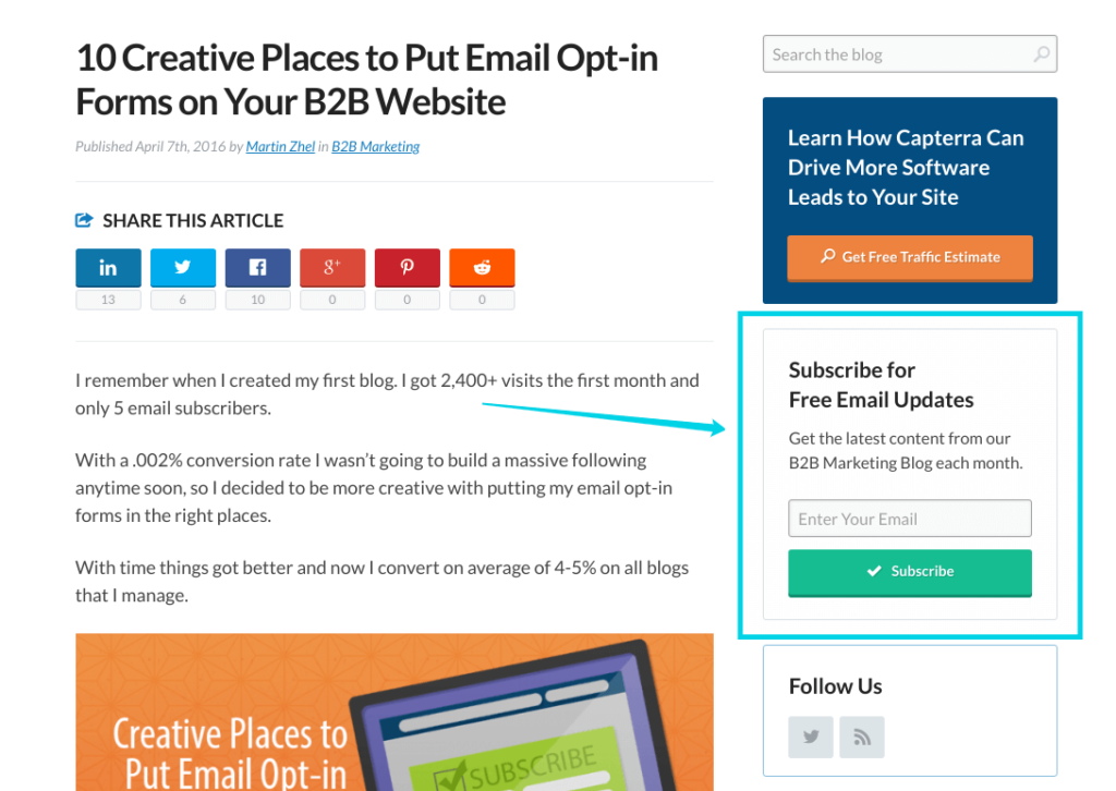
Scroll box
Scroll boxes is a light version of popups. Why? Because it looks the same as a popup, but while popups appear on the whole screen, scroll boxes show in the bottom right-hand corner of the page. It is a good variant for those who have the doubts about popups, considering them as an annoying feature. Scroll boxes appear only when visitors scroll down the page. 
Footer
As a sidebar, a footer is a common place for the email sign up form. Moreover, if the user hits the bottom of your page, be sure that he is really interested in your products or services. So, tell him about the added value that user can get if he signs up. 
Floating bar
It is a good way to get the user opportunity to subscribe whenever he is on the site. Floating bar is what you need! He may be located at the top of the page or at the very bottom, but it still remains in clear view at all times.
Main page
The main page is the first thing which visitors see when they open a site. So, you need to attract the user to scroll down or to subscribe immediately. We recommend offering a special discount or a free gift. 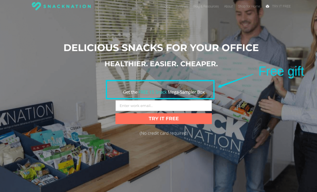
Conclusion
There are the most popular places for your email opt-in forms. Try to test each of them and, then, measure the conversions.