Charts are not just mere illustrations, they are not just drawings, they carry meaning. Alberto Cairo — visual and data journalist
Tips for great data visualization
We live in the world where data really matters. One of the last trends is big data. Therefore, it is everywhere: on the Internet, on the street, in magazines, etc. But with the rising of its popularity, the number of people who can understand the data and correctly analyze it is decreasing. Data visualization is what can solve this problem. It is not about displaying the data with charts, the real value lies in displaying it in a way people easier to comprehend it and get insights. It is more complex discipline than it may seem at first. The tips which we discuss below cover some of the most common pointers to help you to visualize your data in the best way.
#1 Storytelling
Storytelling usually is used for text writing. But who tells that this approach will not work when it comes to the data? Try to tell a story about your data:
- Where did it come from
- How it evolved
- What is the most important conclusion about it
- What needs to be highlighted
- Find any clutter and make notes
The data visualization need to have the start and end points as any story. One of the best examples is “Before/After graphs”. 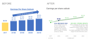
#2 Determine the type of graphic
A lot of people who make a data visualization do not attach importance to the type of graphics. And it is a huge mistake! Bar charts:
- Good for comparisons
- One of the popular type because of it easy to read, our brain only need to compare relative heights of the bar
- For better understanding, the start point should be at zero baselines.
Line charts:
- Use to show a trend
- Do not stretch them because it can lead to confusion: stretching the height can create a fake drama and stretching the width can under evaluate it
Pie charts:
- Try to avoid it and find alternatives
- It hard to read for our brain, because if the parts are close in size, we can skip this difference
Bubble charts:
- Use for comparing and showing relations between circles
- Good for analyzing and finding patterns
Heatmaps:
- Good for cross-examining multidimensional data
- Show any discrepancy across different variables
Histograms:
- Use to show the distribution of data over a timeline
- Good tool to estimate where the values concentrate the most
Of course, we cover only the most popular types of graphs but find the time to learn more about it. Here is a good source.
#3 Keep it simple
It is very important to do a deep research and decide what you really want to tell with the data visualization. People tend to overload graphs with too many notices, and facts placed on them. Moreover, we want to add a lot of design elements like excess color, special effects, and so on. All this can clutter your charts and make hard to understand. 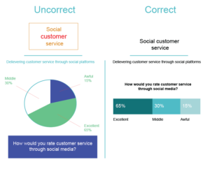
#4 Colors are for communication
It is a great delusion to think about colors in data visualization as a designing tool. It is not. We recommend you to use them to highlight the most important piece of information, other words, for communication. In fact, bright color is good for attracting our attention, so, we notice it quickly, and, then, try to assign any meaning to the mentioned difference. So, too many colors can confuse users. 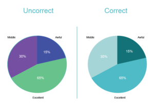
#5 Pay attention to ordering
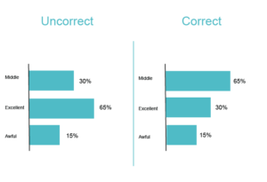
Correct ordering is a good helper to simplify the data reading process.
- Build a logical hierarchy by alphabet, value, etc.
- Items ordering in the legend and on the graph should be the same
How to visualize the data on the WordPress site
In spite of all the WordPress advantages, it has a number of limitations. Our team creates a WordPress Data Table plugin, which allows you to integrate with Google Charts and create amazing graphs. There are a lot of different types of charts, so, you can use any of them. The Data Table plugin has a number of important features:
- Responsiveness
- Online table builder
- Front-end editing
- Database source
- Search
- Sorting
- Pagination
- Export/Import
Read this post to find more information on creating Google Charts and Diagrams with our Data Table plugin.
