
Tips to improve your UX/UI experience
Of course, you’ve heard about UX and UI multiple times. But understanding the difference between these two definitions can get confusing. It’s time to sort things out.
UX vs UI: understanding the difference
At the most basic level, UI is how things look and UX is how they work. In other words, UI is a deliverable and UX is the process of interaction between users and the site. Let’s look at the example. There is a Facebook page. 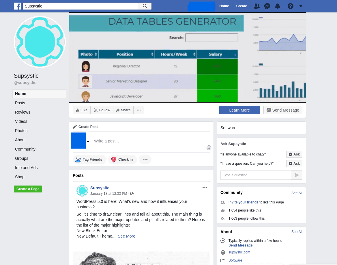 Take a look at this. There is a sidebar, a menu on the top and other buttons like Learn more, Send Message. Also, you may notice the blocks like About, Community, Posts – is all the work of UI designers. They have to create the appearance of the site, so you can see where you have to register or log in, where to write the post or send the message. And now about UX. Suppose, I want to read reviews about the company. I click the button, but nothing happens. Or I want to read a full post’s text but it loads too slowly. As a result, I do not enjoy engaging with the social network, I am annoyed and want to close all this tab. For these problems the UX designers are responsible.
 ![]()
 Attention!
UI is how things look and UX is how they work
![]() In order to understand what are the key components of good UX, Peter Morville, president of Semantic Studios, information architecture, and findability consulting firm, created a good illustration below.
In order to understand what are the key components of good UX, Peter Morville, president of Semantic Studios, information architecture, and findability consulting firm, created a good illustration below. 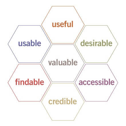 It is called ‘UX honeycomb’. Here’s how Peter Morville explained each component of great UX.
Useful. As practitioners, we can’t be content to paint within the lines drawn by managers. We must have the courage and creativity to ask whether our products and systems are useful and to apply our knowledge of craft + medium to define innovative solutions that are more useful.
Usable. Ease of use remains vital, and yet the interface-centered methods and perspectives of human-computer interaction do not address all dimensions of web design. In short, usability is necessary but not sufficient.
Desirable. Our quest for efficiency must be tempered by an appreciation for the power and value of image, identity, brand, and other elements of emotional design.
Findable. We must strive to design navigable websites and locatable objects, so users can find what they need.
Accessible. Just as our buildings have elevators and ramps, our websites should be accessible to people with disabilities (more than 10% of the population). Today, it’s good business and the ethical thing to do. Eventually, it will become the law.
Credible. Thanks to the Web Credibility Project, we’re beginning to understand the design elements that influence whether users trust and believe what we tell them.
Valuable. Our sites must deliver value to our sponsors. For non-profits, the user experience must advance the mission. With for-profits, it must contribute to the bottom line and improve customer satisfaction.
So, now that you’ve already understood the difference between UX and UI, let’s discover the main principles to improve them.
#1: Contrast and color
The color palette is one of the first things people noticed when they entered your site. By using the right coloration designers can influence how people perceive the site: better visuals – more money. Basic tips:
- Place warm and bright colors in the front, and cold, dark colors in the backgrounds
- Remember about color blind people: develop the alternative grayscale design
- Use one color only for CTA (call-to-action).
#2: Mobile
Mobile devices have become a valuable traffic channel in recent years. So, you have to take care of user’s usability in the mobile site’s version:
- All elements should be big and stay separately from each other: the minimum size touch – 1cm x 1 cm
- The sides and bottom screen are the most reachable with the thumb on a tablet
- Use only a single tap on mobile devices.
#3: Navigation
Customers want to interact with the website as fast as possible. So, you need to make sure that they have an obvious way to access the navigation menu. The most important things:
- Your website should be less than 3-4 level
- Use a sticky menu
- Navigation labels should be specific and contain only 2-3 words. The first word is the most informative word
- Use the breadcrumbs to show users where they are
- Menu dropdowns should be vertical
- Hamburger menus on desktops are less noticeable.
#4: Links
There are two types of links: text and image. Both need to stand out and look like links, meaning you should use blue text and/or underlining to indicate hyperlinks. Basic rules:
- Certain elements, like product images or reviews, should be always clickable
- Use a different color to identify visited and not visited links
- Don’t use link color for other elements on the website.
#5: Readability
Readability features make the scanning process for users faster and easier. The important thing here is not just when users say: “I CAN read this”, but also when they say: “I WANT to read this”. For this:
- Do not forget to use line spacing between the text
- Choose the font very carefully
- On the mobile version, the font should be larger
- Use only responsive elements
- Use italic font only in rare cases
- It is not a good idea to use all caps in headlines and taglines.
So, there are basic tips that help you to improve the UX/UI design and boost sales. But we recommend you hire a good specialist and make the audit regularly. Check out the WordPress Flipbook Plugin by Supsystic