Google Maps Easy Plugin is the best plugin to create easy, well-design responsive maps!
Maps created with the plugin are responsive and perfectly scale to screens of all shapes and sizes.
How does it work?
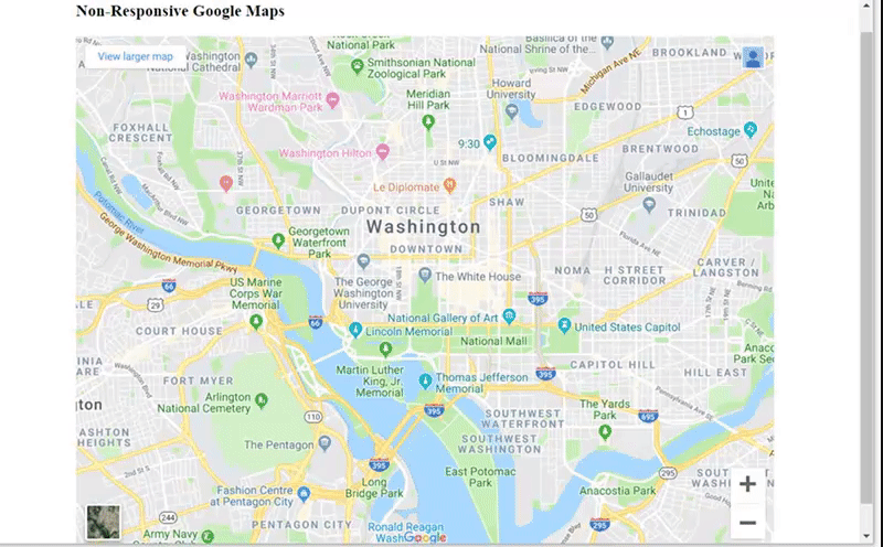
This a sample of map which is non-responsive. It means that if you open the page on a device with a screen differ than your desktop, the Google Map will not be fit the screen and you should to scroll the page to view the map properly.
Here’s Map, created with Google Map Easy and you can see the difference, because now the map is responsively. Thus, if you resize the browser or view the page on a small device, the map will be adjust its size automatically based on screen size.
You can set your map width and height using either percentages or pixels.
In the example , we’ve set the width to be 100% and the height to be 300 PX. Try to change the size of browser window to see the responsive effect.
Google Maps can bring you lots of customers providing your address, directions and landmarks find you. That’s why it’s so important in the world of gadgets and mobile phones, we need maps that are responsive to the devices our customers are using.
Google Maps is a best solution for your website, providing all necessary features and options to set and customize it, but the main thing is that Maps, created with Google Maps Easy Plugin are fully responsive!