
How to Supercharge Your Website with The Magic of a Lead Magnet
Are you ready to take your website performance and email marketing to the next level?
If so, you’re in the right place – Welcome!
We’ve crafted a powerhouse lead magnet strategy to turbocharge your website performance.
And, it’s so good, we use it ourselves!
It’s one thing to get visitors to your site. But it’s an entirely different thing to have them convert as you want.
A well-crafted Lead Magnet Strategy is THE most powerful tool you can use to improve your engagement and conversion. If you’re looking to move the needle, this strategy WILL do it.
In the next few minutes, you’ll learn what works (and what doesn’t).
And you’ll learn how to create your own Lead Magnet strategy using a formidable combination of affordable battle-tested tools.
Introduction
Thousands of websites are underperforming right now.
And, for many small business owners, it’s something they’re embarrassed about.
If that’s you – then that is about to change!
In the dynamic landscape of digital marketing, a well-crafted lead magnet strategy is the secret sauce for propelling your website conversion to new heights.
What is a Lead Magnet Strategy?
In case you’re not familiar with the term – a lead magnet strategy involves offering something of value to your target audience in exchange for their contact information – typically their email address.
“Something of value” is an item that “draws them in” – like a magnet. It’s something they want. It’s something “enticing“!
Imagine you’re walking down a virtual lane lined with shops; a lead magnet is that irresistible, free offer that makes you stop and take notice.
And, to get it, you simply have to provide your email.
Classic examples of the way “something enticing” can be presented include:
- e-books,
- guides,
- webinars,
- access to exclusive content,
- discounts, and
- free trials.
These are all popular forms of lead magnets.
This transaction marks the beginning of a relationship between your brand and a potential customer.
Take the case of ‘Green Thumb,’ a small gardening business.
By offering a free eBook on sustainable gardening practices, they expanded their email list by 30% in just three months.
The key lies in understanding your audience’s interests and offering something that resonates. When your lead magnet addresses a specific need or answers a burning question, signing up becomes a no-brainer for your audience.
HubSpot’s research further supports this, revealing that companies employing lead magnets observe a 50% higher conversion rate. These numbers don’t lie; they illustrate the undeniable impact of well-crafted lead magnets on audience engagement and lead generation.
So, why does it work so well?
Your Lead Magnet is like a bridge that invites your customers to engage with you to get something they want – and they can do so without having to expose themselves to “stranger danger” too much.
That’s a bit “tongue in cheek”, but it explains the psychology pretty well.

And here’s the magic.
After they’ve introduced themselves like this, you have something much more valuable than the potential sale – you have the beginnings of a relationship.
And with that, you can engage with them and foster the relationship.
You can demonstrate your knowledge of a subject that’s of interest to them. And, if you do it well, you’ll quickly be recognized as an authority. Someone worth listening to. You become a subject matter expert.
As you continue using your knowledge and experience to add value to your blossoming relationship, you earn trust.
And, with “trust”, you can make recommendations for products and services. Ones that add further value to the relationship. And then you get “loyalty”.
So, what’s the underlying objective of using a “lead magnet strategy”?
The underlying objective is to:
- Initiate a relationship,
- Establish your authority, and
- Earn their Trust and Loyalty
In a nutshell, we are aiming to have them KNOW, LIKE, AND TRUST us!
READ THAT LAST PARAGRAPH AGAIN, AND OWN IT – BECAUSE THAT SPELLS OUT OUR FUNDAMENTAL MISSION!
But, a word to the wise.., this only works if you deliver “genuine value”. You can’t “earn trust” without it. If you under-deliver with a flimsy solution you’ll get an avalanche of “unsubscribes” and lost credibility. And IMO – rightly so!
Now, if we can agree on that.., let’s look at how we can create some magic and make it happen for you. Here’s an overview of what an effective Lead Magnet Strategy looks like in the digital world…
7 Steps to an Effective Lead Market Strategy
There are Seven Steps to building an Effective Lead Market Strategy. They are:
- Identify your visitor’s key interest (or problem)
- Create a quality solution or offer
- Present Your Offer/Solution
- Capture their Email
- Deliver your Offer/Solution
- Engage, Establish Authority, Earn Trust, and Upsell
- Review, Refine, and Repeat.
Here’s what it looks like step by step.
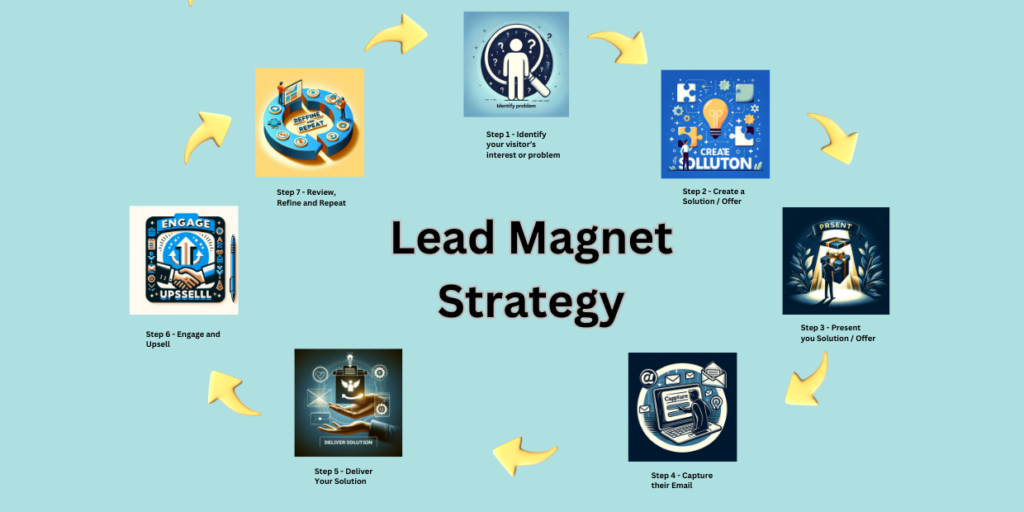
It really is a touch of magic!
What’s Needed to Build Your Lead Magnet Strategy?
To create and manage your Lead Magnet Strategy you need three components or tools.
- Your Lead Magnet (something enticing and of value to your visitors),
- A mechanism to Present your Lead Magnet and Capture Contact Details (typically a PopUp), and
- A mechanism to deliver your Lead Magnet and interact with your contacts (typically an Email Management Service that allows you to automate all the heavy lifting of email sequences).
How you present your Lead Magnet is crucial to your success. A lot of websites get this very wrong!
Let’s look at that first.
Introducing the Wizardry of PopUps
Used properly, Popups are like tiny online wizards, swiftly capturing attention and guiding users through a captivating journey.
These small windows convey messages, showcase offers, and beckon action. They can (and should) be much more than an interruption. Used properly, Popups are an artful dance of user interaction, turning casual visits into interesting conversations and genuine relationships.
Yet, many times we see them used poorly!
Too often, popups appear within milliseconds of a web page loading. This doesn’t give the visitor time to “connect” with the page and generally produces poor conversion outcomes.
We just click them away.
You’re nodding right now, aren’t you? We’ve all done it- many times!
That’s not what we want our prospects to do.
The key to success is presenting a “meaningful and valuable offer” at a time “when your visitor is engaged and interested” in your site.
That means we need to think carefully about when, and how you present your “enticing offer“.
And the tool that allows us to control all this is our much-maligned “PopUp”.
What to look for when choosing your PopUp Plugin.
This is more important than you might imagine.
To get the outcome you’re after, you’ll need meticulous control of your PopUp’s behavior and appearance. And you’ll need detailed analytics to be able to measure its performance.
That’s where a lot of basic popups just aren’t up to the task (like the ones included in page builders).
They simply don’t offer adequate control over the various display options. And they don’t have the analytics capability that we need.
So, make sure you select and use the right tool for the job!
Here are key features to look for when selecting a PopUp Plugin:
- Ease of Use:
- Intuitive Interface: it has to have a user-friendly interface for creating and managing your popups (ideally without requiring advanced technical skills).
- Drag-and-Drop Editor: An easy-to-use editor for designing and customizing your popups visually.
- Customization Options:
- Templates: Pre-designed templates for quick and easy popup creation.
- Styling Options: Flexibility to customize colors, fonts, and styles to match your brand.
- Targeting and Triggers:
- Audience Targeting: Options to display popups based on user behavior, demographics, or other criteria.
- Trigger Options: Various triggers like time delay, scroll marks, exit intent, or other specific user actions.
- Mobile Responsiveness:
- Ensures popups are optimized for a seamless experience on mobile devices.
- Integration with Email Marketing Services:
- Easy integration with your selected email marketing service (we’ll talk more about that in a moment).
- Analytics and Reporting:
- Built-in analytics to track popup performance, conversion rates, and user interactions that will allow “data-driven decision making”.
- A/B Testing:
- Allows you to test different popup variations to identify the most effective designs and content (which ties into the previous point).
- Cookie Control:
- Provides options for managing cookies to control how often popups are shown to users.
- Performance Optimization:
- Ensures that the plugin doesn’t significantly impact website performance, loading times, or user experience.
- Compliance with Regulations:
- GDPR Compliance: Features to ensure your popups adhere to data protection regulations.
- Support and Documentation:
- Responsive customer support and comprehensive documentation for troubleshooting and guidance.
- Frequency Settings:
- Options to control how often a popup is displayed to the same user.
- Security and Maintenance Measures:
- Security features to protect against potential vulnerabilities.
- Regularly maintained and updated in line with WP version upgrades
It sounds like a lot.
And it is, but using the right tool for the right job is invariably a key ingredient to getting a good outcome. So, where do you find such a tool?
I’m glad you asked…
Why Supsystic Popup?
Well, that’s pretty simple—it’s the best-value premium WordPress plugin offering all the crucial features above. It’s been battle-tested for years, comes with great Support, and dovetails perfectly with market-leading email service providers like ActiveCampaign and MailModo.
What if you already have a premium PopUp plugin??
If it ticks the boxes in our earlier list, then you should be fine. If it doesn’t tick the boxes, or you don’t have one yet – then use this link to get The Best WordPress PopUp Plugin.
Here’s what some of our Users have said:
“Suspsytic has helped me increase my email list by 30% in just one month! It’s the easiest popup plugin I’ve ever used.”
Sarah Jones – Blogger
“Suspsytic has helped me boost my website conversions by 20%. I’m so impressed with the plugin and their customer support.”
Mary Brown – Marketing Manager
“Suspsytic is the easiest popup plugin I’ve ever used. I’m not a techie, but I was able to create beautiful and effective popups in minutes.”
John Smith – Ecommerce Store Owner
Next, you need an Email Service Provider or ESP.
Introducing the Magic of an Email Service Provider (ESP)
Your Email Service Provider (ESP) is the tool that does most of the heavy lifting for you. It will collect your contacts, automate your email sequences, and provide you with conversion analytics.
There’s a very good chance it will become your new best friend!
There are many email service providers (ESPs) on the market, but (from our experience) ActiveCampaign and MailModo are two that stand out from the rest.
Choosing your ESP is a decision you want to “get right” from the outset.
If you get it wrong, it can be painful to change later. Not impossible – just painful.
Both ActiveCampaign and MailModo platforms offer a wide range of features and benefits designed to help businesses of all sizes grow their email list and automate their email marketing efforts. And both allow you to start small.
Plus they’re both affordable!
ActiveCampaign
MailModo
But there are some important differences between them – particularly “Interactive Emails”.., we’ll get to that in a moment!
Key features you’ll NEED in your Email Service Provider are:
- Powerful Automation:
- Both ActiveCampaign and MailModo offer powerful automation features that can help you streamline your email marketing efforts – with AC offering a more powerful engine. You can use automation to trigger emails based on a variety of events, such as when someone subscribes to your list, abandons their cart, or makes a purchase. This can help you save time and ensure that your emails are always relevant to your subscribers.
- Extensive Segmentation Capability:
- By dividing the subscriber list into smaller, more focused groups based on specific criteria such as demographics, purchase history, or engagement levels, you can tailor messages to resonate more deeply with each segment. This personalization leads to higher open and click-through rates, as recipients receive content that is more relevant and valuable to their individual interests and needs. Both platforms offer this capability.
- Extensive A/B testing capabilities:
- A/B testing is crucial to optimize your email campaigns and improve your results. Both ActiveCampaign and MailModo offer extensive A/B testing capabilities that allow you to test different subject lines, email content, and sending times to see what works best for your audience.
- Detailed Analytics:
- Understanding how your email campaigns are performing is essential for identifying leaks and making improvements. Both ActiveCampaign and MailModo offer detailed analytics for how emails are being opened, clicked through, and converted.
- Exceptional support:
- Both ActiveCampaign and MailModo offer excellent customer support. If you ever have any questions, you can rest assured that you will be able to get prompt help from a knowledgeable and friendly support team.
- Integration with Suspsytic:
- as you know, PopUp by Suspsytic is a powerful popup plugin that integrates seamlessly with both ActiveCampaign and MailModo.
Interactive Email Capability (AMP) – a nice-to-have feature!
This feature is only available with MailModo – and it’s pretty cool!
If you’re not familiar with AMP, you’re not alone.
It’s a fairly new tool that introduces a host of “user-friendliness” to your emails. It does this by enabling the receiver to complete clickable actions from within the email. This brings your email to life because it’s now “clickable and interactive” for your receiver!
So, instead of clicking on a link in your email and being redirected to a landing page to complete an action, they can get the whole thing done from within the email.
That’s a quicker and cleaner experience for the user.
In a nutshell – it offers “less friction” and promises “higher conversions“.
AMP Email Funnel Illustrating Improved Conversion
Use this link to find out more about MailModo and their AMP Emails.
Now.., back to choosing which ESP platform is right for you.
Here is a side-by-side comparison of some of the key features of ActiveCampaign and MailModo:
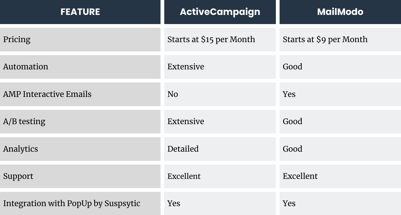
If you are looking for a powerful and affordable email service provider, then both ActiveCampaign and MailModo are great options. Both platforms offer a wide range of features and benefits that can help you grow your email list and reach your marketing goals.
Our EMS pick?
If you’re just starting out and looking for a system that gives the capability for outstanding user engagement within your emails, and one that’s easy to learn and manage – go with MailModo
If you are somewhat established and require more powerful automation sequences with exceptional analytics – go with ActiveCampaign
You can find out more with the links above.
Our Experience at Supsystic
Well, it’s a bit embarrassing, but we did it the hard way. Hopefully, this article will save you the “learning curve” that we had.
We started our email outreach with Gmass (as a budget option- don’t even think about it) and have since used Clayvio, MailChimp, Aweber, and now ActiveCampaign. So it’s a reasonable base of experience.
To be fair, we have a reasonably complex customer matrix.?That’s because we have multiple plugins, various user types, and free and paid plans.
We need to consider:
- two types of customers (Professional WordPress Developers and Novice Webmasters – each of whom have very different needs),
- and multiple products (plugins), with
- each product (plugin) having both a free and paid option.
- plus, each paid plugin has a renewal date – and we need an automation sequence for that.
So we needed to customize the automation/s and emails extensively to consider each contact’s situation. We used their powerful Segmentation and Tag tools along with the API to automate the process.
And it’s been working on autopilot 24/7 for about 15 months.
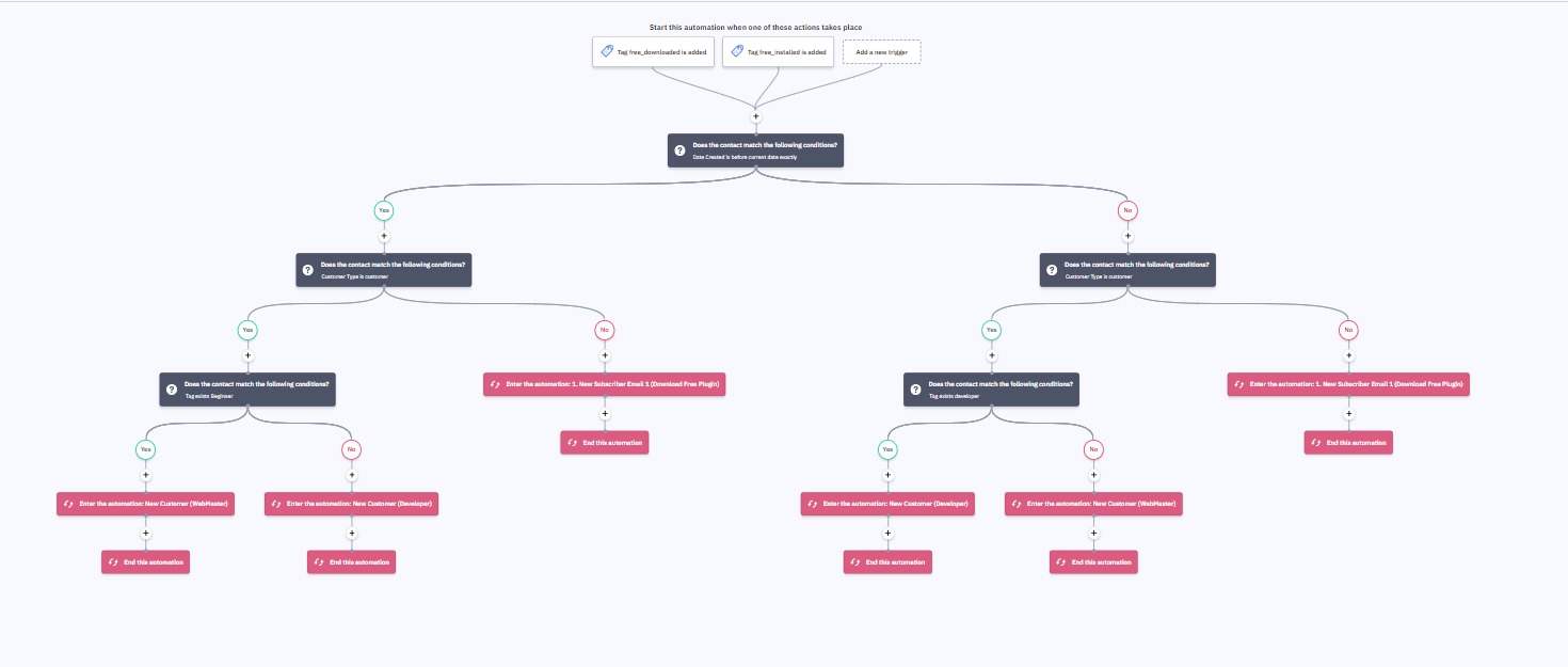
Supsystic’s Logic path in ActiveCampaign for managing subordinate automation sequences
The onboarding experience with AC was good for both our Development and Marketing teams, and their onboarding people were generous with their time. It provided a good framework for us to expand upon – and it’s worked out pretty well.
Over the last 15 months, we’ve built our list to about 8,007 contacts.
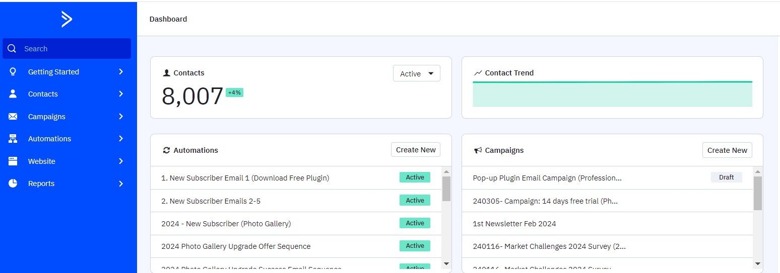
ActiveCampaign Dashboard showing dynamic reporting.
It would be great if ActiveCampaign had an AMP option, but for now – they don’t! That said.., has it worked for us?
Absolutely… it’s probably why you’re reading this!
Roll Up Your Sleeves – Let’s Get Your Lead Magnet Strategy Built and Unleashed
So far we’ve discussed the tools to use, and how the process works.
Now let’s look at creating the CONTENT for your Irresistible Lead Magnet/s.
There are two specific areas to consider.
- Your PopUp Display, and
- Your Lead Magnet content.
Let’s look at the PopUp content first.
How to design your PopUp (so it “pops”!)
Remember, when it comes to creating popups that grab attention, it’s all about striking the right balance between being eye-catching and conveying a clear message, without annoying your audience.
It acts as a visual ambassador, conveying the essence of your Lead Magnet’s content at a glance. It should intrigue, entice, and connect emotionally with the audience, prompting them to pick up the book for a closer look.
So, let’s dive into some design considerations to make your PopUps pop!
- Color Matters: Use bold, contrasting colors that stand out from your website’s background. Your goal is to make the popup impossible to ignore. Think vibrant reds, electric blues, or sunshine yellows. And consider “modal” or “lightbox” styling which fades the background to highlight your message.
- Big and Bold Headlines and Call to Action: Your headline should be like a punchline – short, snappy, and to the point. It should tell your visitors exactly what’s in it for them. Be clear, be concise, and be compelling.?And make sure there is no doubt about the call to action.
- Crisp and Legible Fonts: Don’t make your audience squint! Use easy-to-read fonts in a size that’s comfortable for most eyes. Fancy scripts might look cool, but readability is key.
- Engaging Imagery: A picture is worth a thousand words. Use images that support your message and resonate with your audience. Smiling faces, enticing products, or attention-grabbing graphics – choose wisely.
- Animation & Movement: Subtle animations can draw the eye without overwhelming. A little movement can add life to your popup and make it more noticeable. But don’t turn it into a disco party!
- Popups with Purpose: Don’t just throw popups around like confetti. Each one should serve a specific purpose – whether it’s signing up for a newsletter, getting a discount, or accessing exclusive content. Make the value clear.?And start slowly with just one or two- Google has penalized sites that have abused popups in the past.
- Mobile-Friendly: Remember that many people browse on their phones. Ensure your popups are responsive and don’t cover the whole screen on mobile devices.
- Easy Exit: Always include a clear and easy way to close the popup. Nobody likes a popup that’s impossible to get rid of. Give your visitors an escape route!
- Timing is Everything: Consider when and where your popups appear. Timing matters! Don’t assault your visitors the second they land on your site. Allow them a moment to breathe before your popup takes center stage.
- A/B Testing: Never assume you’ve nailed it on the first try. Test different designs, headlines, and timing to see what works best for your audience. What grabs one person’s attention might not work for another.
Remember, the goal is to grab attention without annoying your audience. Keep these design considerations in mind, and you’ll be well on your way to creating popups that not only get noticed but also deliver results. So go ahead, make those popups pop, and watch your engagement soar!
A good rule of thumb is to make your heading (or grab-line) the solution to their problem. Consider things like:
- “How to…”, or
- “Learn the five critical…” or
- “7 Ways to Improve Your…“
Here’s an example that might ring a bell with you…
Note the “How to… ” message along with strong colors to get your attention, and an image to convey the outcome.
That’s what I want…
I want to SUPERCHARGE my website and WATCH IT TAKE OFF!
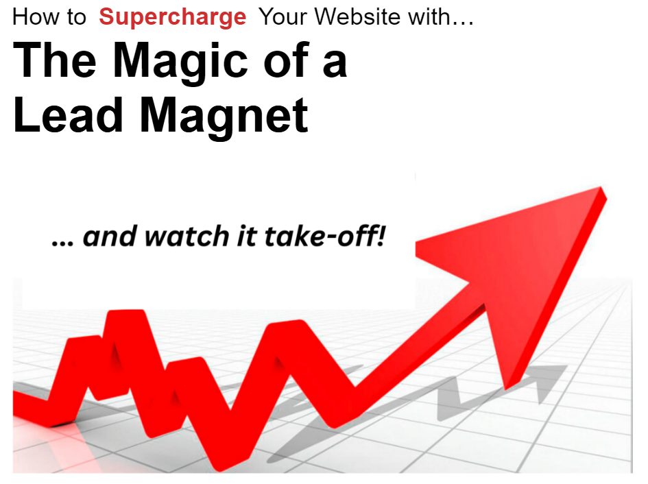
Let’s look at some more examples to get your creative juices flowing:
Retail Application – blurring the main screen helps focus attention on the discount offer. If you have an e-commerce store, this is a must-have strategy.?But it also works for brick-and-mortar retailers.

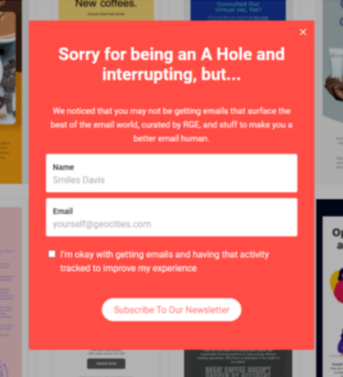
And sometimes just being a bit quirky will get the job done.
Bold colors and obscuring the entire screen mean you can’t ignore it.
Note they’ve given an obvious mechanism to close the PopUp – that’s good practice.
It would be interesting to see the conversion analytics!
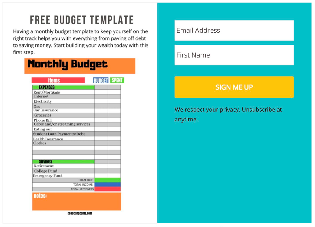
Here’s an offer of a free Budget Template built with a spreadsheet.
Bold colors with a clear message – and you know what you’re getting from the graphics.
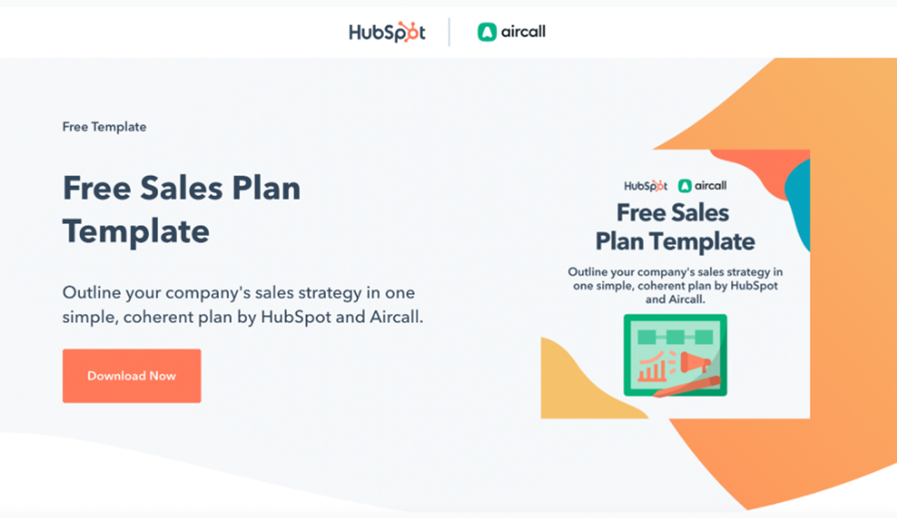
Another free Sales Plan Template from Hubspot – one of the biggest proponents of the Lead Magnet Strategy.
Now, let’s get to Creating Content for Your Lead Magnet
Remember the key takeaway?
You have to produce a compelling offer that resonates with your audience.
Read that last line again.
So, how do you do that?
This follows a similar line as the PopUp – with a few additions.?Let’s take a look:
Considerations in Creating Your Content
- Relevance:
- Your content should be highly relevant to your target audience and their needs. It should address a specific problem or pain point they have. The more closely it aligns with their interests and challenges, the more effective it will be.
- High Perceived Value:
- Your content should offer something of significant value to your audience. It could be in the form of information, tools, templates, discounts, or exclusive access to resources. The higher the perceived value, the more likely people are to opt in.
- Solves a Problem:
- Your lead magnet should provide a solution or offer actionable insights that help your audience overcome a particular challenge. It should provide real, tangible benefits.
- Clear and Compelling Title:
- A well-crafted, attention-grabbing title is crucial. It should clearly convey what the lead magnet is about and why it’s valuable. Use benefit-driven language that highlights what the reader will gain. Tell them how it will solve their problem.
- Professional Design:
- The design and presentation of your lead magnet matters. It should look polished and professional. People are more likely to perceive value in well-designed content. Use AI for your raw content, but don’t forget to edit and polish it.
- Easy to Consume:
- Make sure your lead magnet is easy to understand and consume. Use clear language, organized content, and, when applicable, visuals to aid comprehension.
- Specific and Focused:
- Keep your lead magnet specific and focused on a single topic or problem. This helps prevent overwhelm and ensures that the content is highly relevant to the reader.
- Actionable Content:
- Provide actionable advice or steps that readers can implement immediately. If they see results from your lead magnet, they’re more likely to trust you for further guidance.
- Demonstrates Expertise:
- Your lead magnet is an opportunity to showcase your expertise and establish trust with your audience. Provide valuable insights that demonstrate your knowledge and solve their problem.
- Call-to-Action (CTA):
- Include a clear and compelling call-to-action that encourages readers to take the next step after consuming the lead magnet. Whether it’s signing up for a webinar, subscribing to your newsletter, or making a purchase, guide them toward the desired action – make it very clear.
- User-Friendly Format:
- Choose a format that’s user-friendly and accessible to your target audience. Common lead magnet formats include eBooks, checklists, templates, webinars, and video tutorials.
- Promotion and Distribution:
- Don’t just create your lead magnet; actively promote it through your website (with PopUp by Supsystic), but also use social media, email marketing, and other relevant channels. Ensure it’s easily discoverable.
- A/B Testing:
- Experiment with different lead magnets and formats to see what resonates best with your audience.
- Compliance:
- Ensure that your lead magnet and opt-in process comply with data privacy regulations, such as GDPR or CAN-SPAM, to build trust with your audience.
- Easy Unsubscribe:
- It’s important to give your contacts an easy way to unsubscribe. If your content doesn’t match your contact’s interests, you don’t want them to be on your list. Periodically, “scrub” your list to make sure you don’t have too much “dead wood” costing you money and tarnishing your email credibility.
By now, you should have figured out what your first Lead Magnet will be like.?You should have a feel for what your PopUp will look like, and how you want it to behave.
So, NOW you have to get creative!
If you’re a natural wordsmith, this is the fun bit!
Of course, if you’re not – then this can be somewhat daunting.
The good news is there’s now a great tool that might save the day- Artificial Intelligence (AI).
The Wizardry of Artificial Intelligence (AI)
Utilizing AI for content creation marks a significant advancement in the digital landscape. AI-driven tools enable the efficient generation of diverse content, ranging from text and images to complex data analyses, offering huge time-saving benefits and enhanced creativity.
However, it’s essential to blend AI’s capabilities with human creativity and oversight to ensure the content remains authentic, ethically sourced, and aligned with YOUR voice and objectives.
A couple of stand-out content tools include Designerr AI Software and SurferSEO. They each specialize in different areas. This table provides an overview of features and benefits.
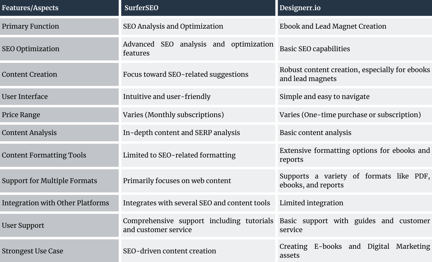
Find out more with these links: SurferSEO and Designerr AI Software.
Wrapping It Up.
Hopefully, you now understand the incredible value of using lead magnets in email marketing. And you have a bunch of great tools to help bring it all together.
Done properly it transforms the way you engage with your audience, turning casual visitors into loyal subscribers and customers.
And Lead Magnets offer immense value to your audience too; providing them with useful, relevant content.
This strategy is the cornerstone of building a strong email list, essential for any successful email marketing campaign.
Our hope is you will now add this strategy to your marketing toolbox.
It really will Move the Needle for you.
And to save you from searching for links… here’s your toolbox!
And if it all looks too hard, click here for our Done-For-You Service