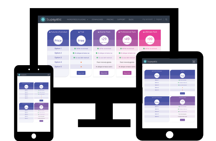
Responsiveness is one of the standard practice if you want to create a good customer experience across any device or platform.
Our Pricing Table plugin is a mobile-ready, means that it will render on the devices with different screen size.
Why is the responsiveness so important?
With the responsiveness you will get:
- The working pricing table on any devices or platform (iPhone, tablet, computer)
- Readable text without requiring zoom
- All elements will resize automatically
- No horizontal scrolling on devices with small screen
- Optimized browsing experience
- Decreasing the time requiring for content management
Responsiveness consist of three main components:
- Fluid grids which rearrange themselves to meet the size of the screen
- Media queries is the code that defined CSS across multiple layouts of the web design
- Flexible images and text which adjust themselves within a layout grids
Usage
The responsiveness is turn on in the pricing table plugin by default, but you can switch off it anytime. Also, users have the opportunity to set a minimum column size.
