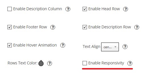
Responsive mode is enabled by default in Pricing table settings. It’s special mode which provides nice and proper view of your table on any device –
- PC desktops
- Mobile phones
- Tablets
In this mode the table adapts to the screen dimensions. It’s really useful option for mobile devices. When device screen is small table will go into responsive mode: all columns will be shown one-by-one below each other. If you don’t need Responsive mode – just disable it by removing the tick for “Enable Responsivity” checkbox.

Besides, if you enable “Description Column” for the pricing table – description column will be shown near the each column of the table in Responsive mode. In this case, your table will be more informative.