We’ve built our Ultimate Maps plugin to be responsive. You can set your map’s width and height using percentages or pixels.
What is Responsive Map?
If you open a non-responsive map on the device differ to your desktop computer, the Map won’t fit the screen. To complete the map you’ll have to scroll the page.
Responsive map adjusts its size based on the screen size.
This is optional when working with your map, but a great idea to provide the greatest user experience for your viewers. Users are typically on the go when they’re looking for directions, so this responsive map will be helpful when they are using their mobile device.
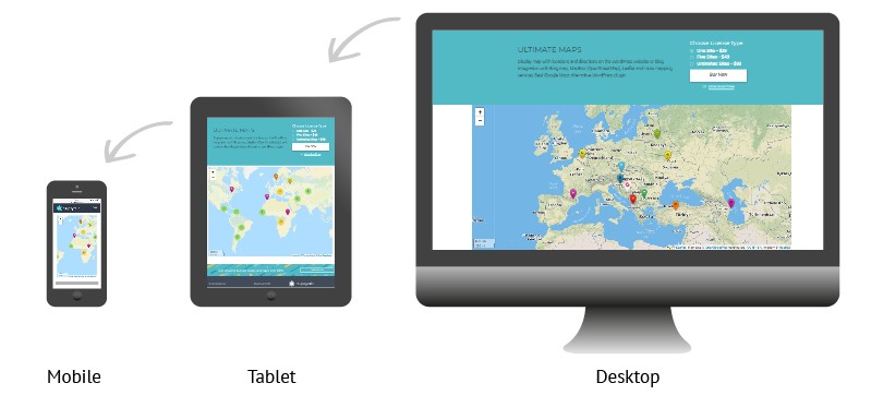
Try reducing the page size of the window to see the responsive behaviour of the Ultimate map:
You can see how it adjusts to the page size with no need to scroll or zoom and stay proportional as it scales down.
Enrich your website with a responsive, fully customizable map.
Look at all the examples and features of Ultimate Maps by Supsystic.