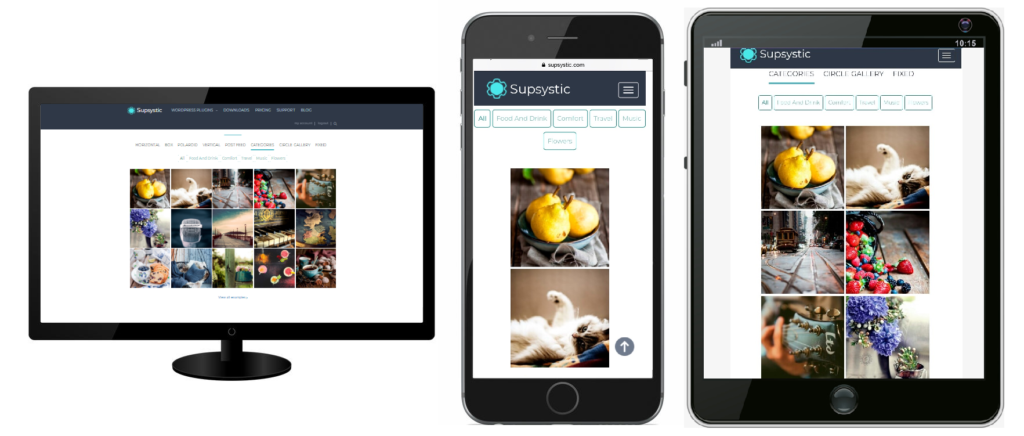
A gallery is a really attractive and important part of the website. It has to look perfect.
We made sure that with the help of our plugin, created galleries look great and is intuitive to use on every device.
That’s why Photo Gallery Plugin is fully responsive and mobile friendly.
How does it work?
Responsive design is when a website resizes to fit the screen it is being displayed on. In practice, this means websites on mobile devices have smaller images, single column layouts and are frequently less complex, whilst on larger screens a website may have multi-columns and more complex layouts.
Thumbnail elements of every gallery will look good on desktop computers, tablets or smartphones and adapts to your screen size, making it convenient to use. Check our examples and try Photo Gallery Plugin right now to be sure, we care about the aesthetic look of your website and visitors in advance.


