How Should Entry Pop-Up Look Like
Setting up pop-up is one of the most popular and effective (if used right) way to increase conversion rate on your website. It is used mainly to engage users not for direct sales. This is the tool you should very carefully as pop-up can either spoil your statistics or boost conversion. In this article we are going to disclose subject of entry pop-ups – this is the most controversial type of pop-up windows. The reason most of marketers and users hate entry pop-ups is the fact it appears when you do not even know what is the page you have entered. It appears immediately and most of the users are likely to close it. However, if you know how to make catchy entry pop-up you will experience serious growth of conversion rate. So when user sees your pop-up before he saw the page content he has three options:
- Submit/Subscribe etc.
- Skip/Close Pop-Up.
- Leave the website.
Your goal is to make person choose first option. It is hard but rewarding. The thing is if user makes conversion action from the beginning he is likely to proceed with other target actions as well. However, due to high risk of failure for this type of conversion tool one needs to provide deep A/B testings and design for each popup. You’ll have to make sure bounce rate is not affected negatively as well. So below there are examples of PopUps that are likely to work.
Newsletter
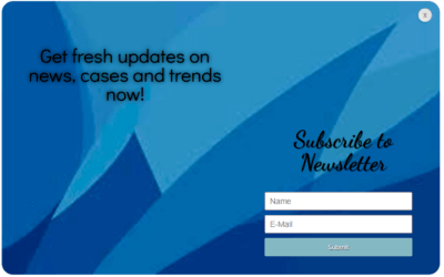
First example for consideration is subscription for newsletter pop-up:  This pop-up appears right after page is loaded – user is offered to subscribe on newsletter dedicated to Internet marketing. What are the strong sides:
- It is a flat design eye-friendly window of solid blue colour. It is not irritating, so user is not provoked to close it immediately.
- There is a service logo which is clearly visible and it gives positive effect on subscription probability especially if user is acknowledged with company.
- There is a notebook and a pencil clearly visible. This image brings trust to what is written and makes company look more reliable in client’s sight.
- Headline font color correlates with background – it is clearly visible and content is catchy. I also like that there is only one sentence of text which discloses essence of the offer
Weak sides of pop-up:
- Close button is too little which makes it more difficult for user to close the window – it is against user-friendliness principles.
- If company has not gained renown yet, there is no enough information about the newsletter. Such a short offer to subscribe is only possible for well-known companies.
Video Invitation
This pop-up is an example of video pop-up:  It lasts couple of minutes and there is no form to fill in. Just like all other entry pop-ups it appears immediately. Strong sides of this window:
- This invitation is well-shooted – it contains of several clips of course lections. It is interesting to watch this video and it discloses the essence of the course.
- There is no need to entry your personal data or subscribed. It is just a video to get acknowledges with service.
- All information in the video is relevant.
- Once you get to the page video starts automatically. It doesn’t start with loud noise or irritating moments, so there is no will to close it.
- Close button is clearly visible.
Weak sides of the pop-up:
- It could be more dynamic.
- There is no registration or subscription form that can fill in and there is neither link to make a request for participation.
This pop-up has no conversion action – it was only set up to provide information about service.
Social Proof
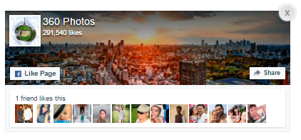
Below is the example of pop-up designed to get a social proof. Social proof is a marketing term which means recognition by public. Here is a simple example of social proof – you see two stores with similar products – one store is full of customers, another one is empty. You are likely to go to first store as you are likely to think that you will get more customer satisfaction there due to the fact majority of people have chosen it. So this pop-up was designed to get social proof – the more likes the page has, the more is the trust to resource because it gained social proof. So the targeted action is Facebook Like.  Pop-up is designed for those who have Facebook account. It is easy to give a like in a single click especially if user is grateful for some kind of a service, so it is an easy conversion. On the contrary to pop-ups that are designed to make person subscribed there are no consequences for user if he just gives a Like. If there are many users that have already liked the page this affects user that sees pop-up to give a like as well due to social proof. Request is written shortly so it doesn’t take much time to read. The only minus this pop-up may have is – if pop-up is shown again to user that has already gave a like.
To Sum Up
It can be demanding to make entry pop-up, however, if constructed carefully and content is catchy and design is smooth it worths a risk. One thing you should keep in mind when setting up such window – make sure you wouldn’t close it if you would be a client. With Popup plugin by Supsystic you can create different popups that allow you to increase subscription list or your site rate.
