How to Use a WordPress Popup to Massively Increase Sales
In this article, we’ll be talking about how to use a WordPress popup plugin to massively increase your sales.
Do you want to increase your average order value and turn visitors into customers?
If so, then you should consider creating pop-ups to promote your best products and services to your website visitors.
This blog post will give you the tips and tricks you need to create an effective popup that converts visitors into customers. Let’s get started: 
What is a WordPress Popup Plugin?
A popup plugin is a piece of software that makes it easy to create pop-ups on your website.
It’s like an online store builder, except it focuses on creating pop-ups instead of pages.
WordPress popup plugins are a great way to increase your sales. They help you capture more leads, get more opt-ins, and create a better visitor experience. These popup plugins come in different forms: some are simple to use, while others have more features.
The best part is that you don’t have to be an expert coder to use them. With the right plugin, you can create popups in just a few minutes. Let’s look at the types of popups you can create with the best WordPress plugin.
What Are the Types of WordPress Popups You Can Create?
 There are many types of popups that you can create today. The most basic one is a traditional popup, which appears as a box over your website’s content. You can choose:
- What message to display.
- When to display it.
- Where on your site it should appear.
Here are some of the most popular popup types:
#1. Lightbox popups
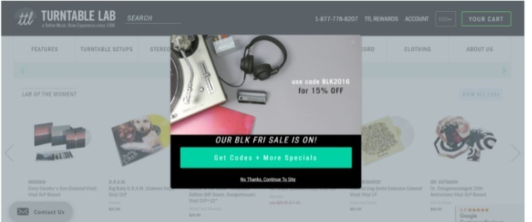
Image Credits: Wisepops
Pop-ups are most often displayed as lightbox windows on websites.
Lightbox popups are useful for showcasing products/services and encouraging user interaction. However, they can be distracting and should be used sparingly for valuable content. For capturing email addresses, regular modals are recommended. Place lightbox popups after users have engaged with a certain amount of content to increase the likelihood of action.
#2. Survey popups
Survey pop-ups offer a way to get feedback from your users.
You can use survey pop-ups to learn what your audience wants or needs. This will help you make better product decisions in the future. You should use survey popups after the user has read a certain amount of content or scrolled down the page. You should also make sure to ask questions that are relevant to the user. For example, if you have a blog post about health and fitness, then don’t ask users about their favorite TV show.
#3. Exit-intent popups
These exit popups are one of the most effective but also the most annoying. They appear after a user has interacted with your site and is about to leave, often in the form of a button that says “Don’t leave!” or something similar. 
Image Credits: Agile CRM
You can also use an exit-intent popup to ask for feedback or allow users to share your content on social media. Exit-intent popups have a high success rate because they allow you to catch users before they leave. They also allow users to reconsider their decision, which can increase conversions by up to 15%. They are available in two forms:
- A mobile exit popup—appears on the user’s screen when they are about to leave your site from their mobile device.
- A desktop popup—appears on the user’s screen when they are about to leave your site from their desktop computer.
Both offer a way to keep your visitors on your site longer and increase conversions. You can use them to ask questions, get feedback, or promote an offer. They are also effective at keeping users from leaving without buying anything or making a commitment. If you have an e-commerce site, then exit popups will remind customers about the items in their shopping cart or offer an incentive to complete the purchase.
#4. Subtle Popup
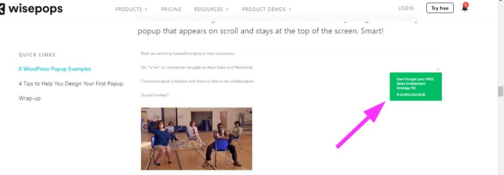
Image Credits: Wisepops
Subtle Popup is a lightweight, user-friendly pop-up that appears on your website when visitors enter a page or click a link. It displays in the corner of the screen without interrupting their browsing experience, capturing their attention effectively. The popup has an attractive design with clear text and a non-distracting call-to-action button. Additionally, it solves the issue of disappearing call-to-actions by allowing the button to remain visible even after the visitor closes the popup.
#5. Mobile Popups
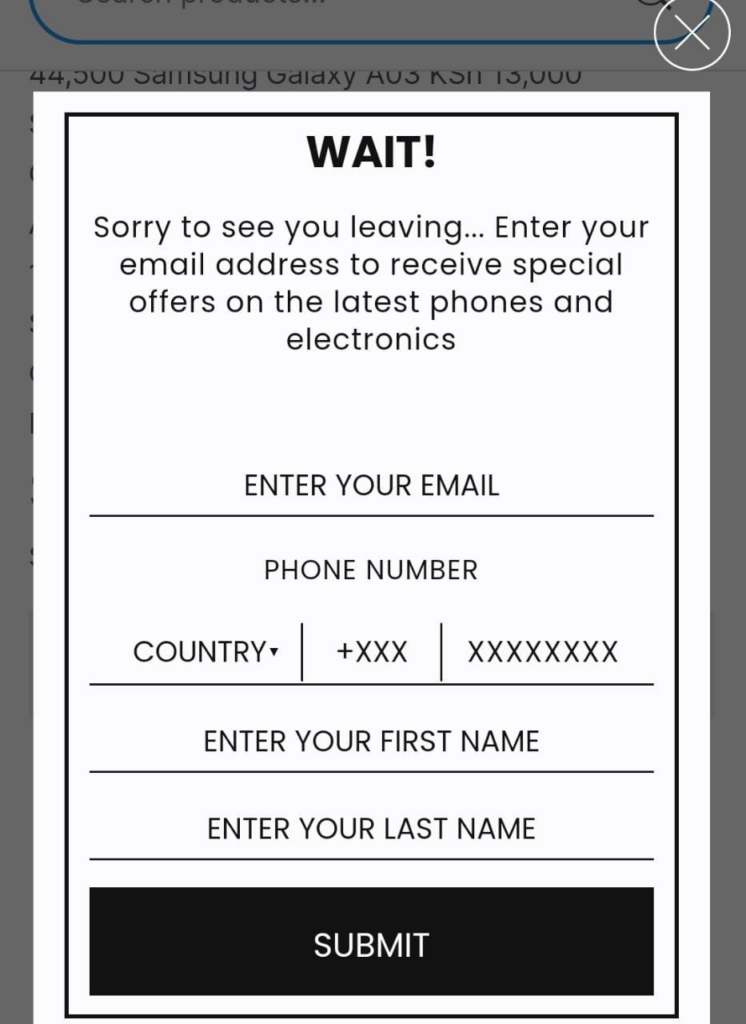 These pop-ups are designed to be displayed on mobile devices. Unlike desktop pop-ups, mobile popups are usually smaller and less intrusive because they only take up part of the screen. They are most commonly used to show coupons, promotions, or call-to-action buttons. Mobile popups offer the best opportunity for mobile users to interact with your brand. While most mobile popups are triggered by a user action, such as clicking on an ad or website link, some can be set up to display automatically when the page loads.
#6. Slide-in popups
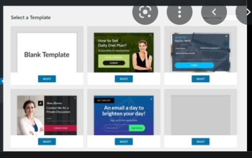
Image Credits: Convert Pro
Pop-ups can slide in from the top or bottom of the screen.
Slide-in pop-ups are commonly used to display coupons, promotions, and call-to-action buttons. They have a small footprint and are less intrusive than other popups. Marketers use them for blog posts as they automatically appear without requiring user action.
Some slide-in pop-ups have an exit button to allow users to close them if they aren’t interested in interacting with the brand at the moment.
The good news is that you can use all these popups on your blog.
But before you put up any form of popups, make sure they are not annoying or invasive.
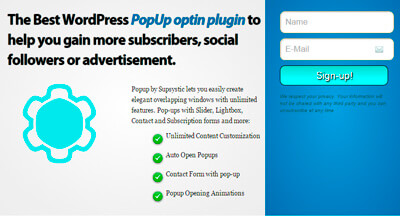
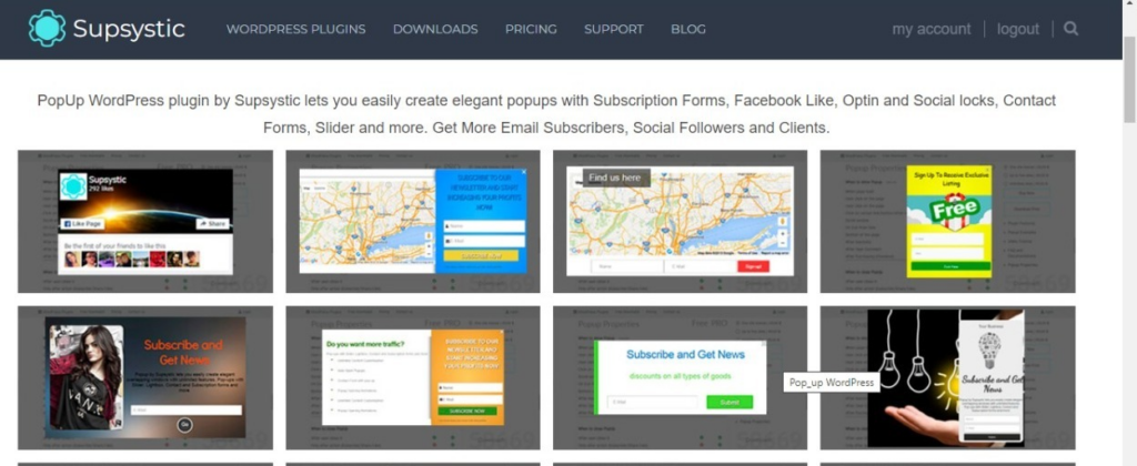
Here is the Supsystic WordPress popup plugin you can use to create popups on your website.
Why Does Your Website Need Popups?
Popups can help you grow your blog and make more money. Here are some of the reasons why you should start using popups:
Grow your subscriber list
 You can use popups to ask visitors to sign up for your email list and then send them a welcome email when they do. Connecting a popup to email marketing is one of the best ways to build an audience on your blog. Click to learn How to Supercharge Your Website with the Magic of Lead Magnets.
Get more sales
 Marketers use popups to sell products and services. You can use them to increase your conversion rate and make more money from your blog. For example, an exit popup might work like cart abandonment reminders and encourage people who are about to leave your site without making a purchase to add something to their cart.
Engage with readers
Popups can help you connect with your audience and build trust with them. This makes it easier for them to convert later on down the line when they need your product or service.
Why Use a Popup Plugin?
Popup plugins aid in the creation and management of popups.
You can customize designs, set triggers for specific times and places, track conversion rates, and more.
Using the best WordPress popup plugins has several advantages:
1. They are easy to install and use from the WordPress repository.
2. You have control over the appearance and behavior of your popups.
3. Triggers can be set up to display popups on specific parts of your site.
4. Popups can be tracked to measure effectiveness.
5. They save time by eliminating the need for manual creation or hiring a developer.
To choose the right plugin, read reviews from others. The Popup Plugin by Supsystic is recommended for creating customizable lead-generation forms. Install and create your first popup using the Supsystic Popup Plugin.
10 Tips To Help You Increase Sales With Popups
Popups help marketers increase conversions and boost sales. But if you’re not using them properly, they can hurt your sales instead. Here are 10 tips to help you get the most out of your popups:
Define your goals
You should know what you want to achieve with your popup. Will it help you collect emails? Get people to sign up for a free trial. Or Sell a product or service? Find out your goals and align your popup with them. This will help you create a more effective popup and get better results.
Ensure your popup is eye-catching but not too distracting
Many online shoppers are on mobile devices with limited screen space, so don’t use too many graphics or text in your popups. Instead, use simple designs that don’t take up too much room. For example, use simple shapes like circles and squares with minimal text to create popups. You can also use a contrasting color scheme that makes it easy for users to read your popup without straining their eyes. This is especially important if you’re using a pop-up to sell a product, as it will give people an idea of what the product looks like without having to click through and view it on your website.
Keep your messages relevant and engaging
The language in your popup is important.
Make sure it resonates with your audience and offers something valuable. Avoid generic messages like subscribe to our newsletter or buy our product. Create a popup that grabs attention and connects with the user’s interests. This will keep them engaged and more likely to convert.

Give a relevant incentive
If your popup offers something useful to the visitor, they will be more likely to fill out the form and give you their email address. You can use this to your advantage by offering a free trial, a discount on a product or service, and more. Offer something valuable for free before asking for some information from the reader.  For example, you could offer a free guide on how to start your own business or an ebook related to your product. Then you can ask for their email address to send them the free guide or ebook.
Set up multiple popup campaigns
Creating multiple popups with different triggers and messages will help several targeting options. You can create a popup that appears when users visit specific pages on your website, or you can even set up a trigger so that it only appears if someone has been inactive for a certain period of time. Multiple campaigns also offer you the best way to test which popups are most effective and which ones aren’t working as well. As you continue to test and improve your popups, you can slowly eliminate the ones that aren’t working as well.
Use the right timing and placement
The best time to display a popup is after someone has been on your site for a while. This gives you a chance to catch the user’s attention when they’re most engaged with your content. In addition, try placing your popup at different places on your page, such as above or below the fold. This will help you find the best spot for your popup and give it more visibility.
Create a sense of urgency
 A common mistake is using a popup that offers users something people can get at any time. This doesn’t create any sense of urgency and makes it less likely that your site visitors will convert. Instead, try offering them exclusive or limited-time-only deals (like “buy now while supplies last”).
Use a compelling CTA
Your popup aims to drive more conversions, so ensure your call-to-action is clear and easy for users to understand. Make it stand out from the rest of the page by using colors or fonts that differ from those around it. Avoid using CTAs that are vague or unclear, as these can confuse users and cause them to leave your site. If you want your visitors to click an image or button, make sure it’s clear what will happen when they do so.
Use a simple, clear design
Ensure your popup is user-friendly with clear navigation. Use simple graphics and text, avoiding complex images or animations that may distract visitors from their intended actions.
Avoid using popups that block content on your website as it can frustrate visitors and make them leave. Instead, focus on using popups to provide helpful information. Track the performance of your popups and adjust your strategy accordingly. Collect data on the number of clicks, post-click behavior, and conversion rates. If your popups are not achieving desired results, consider changing the message or presentation, or even removing them altogether. Test different types of popups to find what works best for your audience.
Avoid using popups that obstruct content on your website. Popups should provide information, not hinder access to it. If content is blocked by a popup, visitors may leave, assuming the page is malfunctioning.
Track your popup’s performance and adjust your strategy based on data.

Track click-through rates, post-click behavior, and purchase conversions to evaluate the effectiveness of your popups. Adjust your message or presentation if desired outcomes are not achieved. Consider removing or testing different popup types to find one that resonates with your audience. 
Final Thoughts
We hope you’ve enjoyed this guide to using a WordPress popup plugin to massively increase your sales.
We know it’s not as simple as clicking a button, but you’ll see the difference once you have it all set up. And you’ll fall in love with the WordPress Popup technique.
Here is our WordPress Popup builder. It provides a set of tools for you to create the perfect popups for your site.
