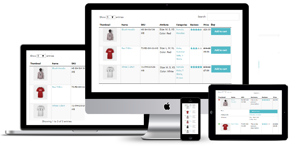
Sales via smartphones and tablets account for 35%.
That’s why it’s really important to make product table easy to browse and navigate, convenient and stress-free as much as possible.
WooCommerce Product table adapts the tables to the screen dimension in the most suitable way to use and works smoothly on desktop, tablet or smartphone.
Responsive Modes Feature resolves all problems by optimizing the table’s layout for different screen sizes through the dynamic insertion and rebuild of columns in the table.
Plugin provides 4 different modes of Responsive design according to your needs:
- Standard Responsive mode. In this mode if table content doesn’t fit all columns become under each other with one cell per row.
- Automatic column hiding. In this mode table columns will collapse from right to left to parent container width.
- Horizontal scroll. In this mode scroll bar will be added if table overflows parent container width.
- Disable Responsivity – default table fluid layout.
Here you can see the examples of the modes and the difference between their options:


