WooCommerce Product Table comes with 4 responsive modes to control the tables behave on different screen dimensions (PC, mobile phones and tablets):
- Standart Responsive mode
- Automatic column hiding
- Horizontal scroll
- Disable responsiveness
In order to set Responsive Mode, move to the Setting -> Features Tab and select the require type.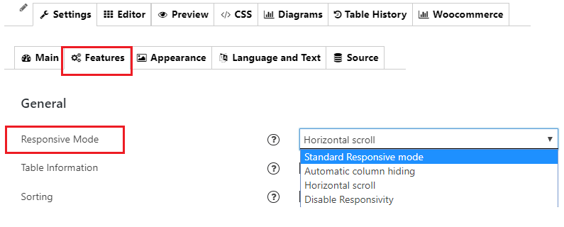
Standard Responsive mode
In this mode if table content doesn’t fit the screen size, all columns go under each other with one cell per row.
Automatic column hiding
In this mode table columns will collapse from right to left if content does not fit to parent container width. It means longer content will “wrap” onto extra lines as needed. This mode is perfect if you have a lot of columns in your table and the plugin can’t fit everything in. When the screen size gets too small, the plugin will collapse certain columns down so they are no longer visible, and a “+” icon will appear at the left of each row. This allows the user to expand the row to show its full contents. 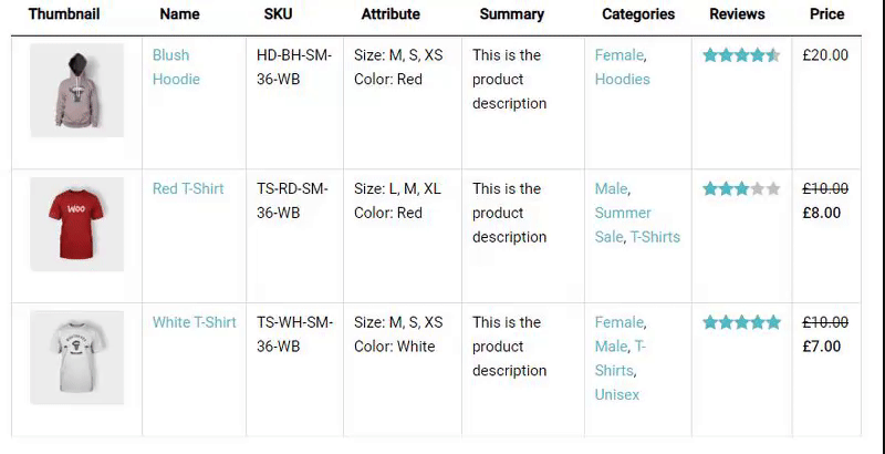
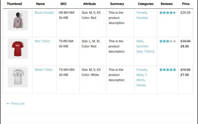
Horizontal scroll
Enable a Horizontal scroll responsive mode, scroll bar will be added in bottom of table if table overflows parent container width.
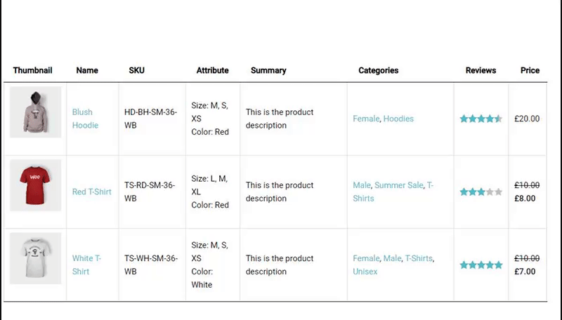
Disable Responsivity
This is default table fluid layout that displays full size table with no appearance changes.
Here you can see Mobile visibility and the difference between responsive options.


