How to visualize data table information with charts and diagrams?
The importance of the data cannot be overestimated. It is what influence the decision making both business and customers. But the data alone nothing to tell you, you should learn how to read and analyze it. It’s often been difficult to present data in an easy-to-digest manner. Therefore, the Supsystic Data Tables plugin provides the option to create and manage data table information with responsive Google Charts and Diagrams. Wondering how to create them? Take a time to read this article.
Which chart types do you have?
Supsystic provides you with all chart types you could need:
- Area chart
- Line chart
- Pie chart
- Bar chart
- Column chart
- Bubble chart.
Also, you can read our previous blog post where we discussed the tips for great data visualization.
 What do I need to prepare?
The first thing is to install and, then, activate the Supsystic Data Table plugin. The next step is to create a new table or import the existing data. Learn how to do it in our docs. Our plugin supports large and small data sets, which are easy to manage from front-end or back-end. Also, if you change something in the tables after creating the diagrams, the data will automatically update in the charts. ![]()
 Attention!
The chart’s data automatically updates after editing the table’s data
![]()
What’s next?
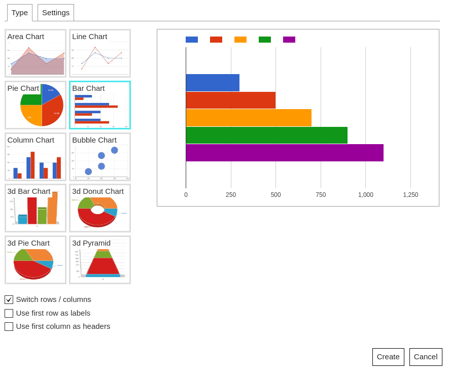
Now we will start to create your first diagram. For this, select data range and navigate to Editor -> Add diagram. 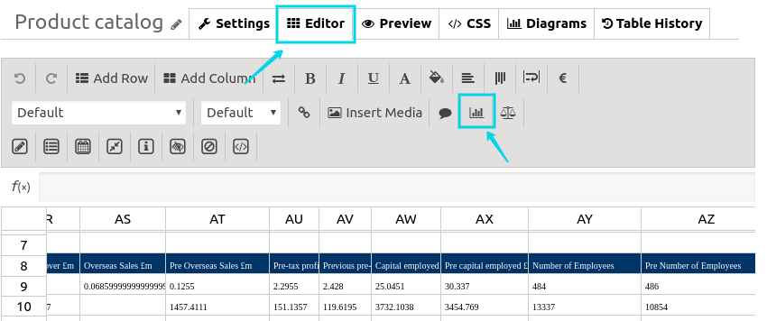 After that, you will see a new window with different diagrams types. Choose the best one and customize it. The first Tab is Type. Here you can:
- Switch rows/columns
- Use the first row as labels
- Use the first column as headers
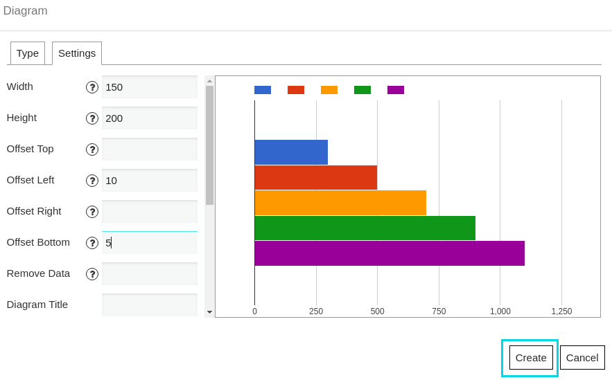
 Then, switch the tab to Settings and set the settings for:
- Width
- Height
- Offset Top
- Offset Left
- Offset Right
- Offset Bottom
- Remove Data
- Diagram Title
- Legend Position
- Axis X Title
- Axis X Format
- Axis Y Title
- Axis Y Format
- Stacked Columns
- Use Custom Colors.
 That’s all! You have just created a new diagram.
How can I use the chart on my website?
In order to use the new chart on the website, go to Diagrams tab and copy shortcode under the diagram. Then, paste it into the page or post. 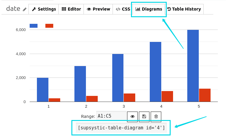 As a bonus, watch a tutorial video “How to create Google Charts with Data Table WordPress plugin”.