With WooCommerce Product Table you are free to customize the table design and make it more attractive for customers.
In plugin you can find all necessary settings to set the table appearance:
Table elements in the Main tab:
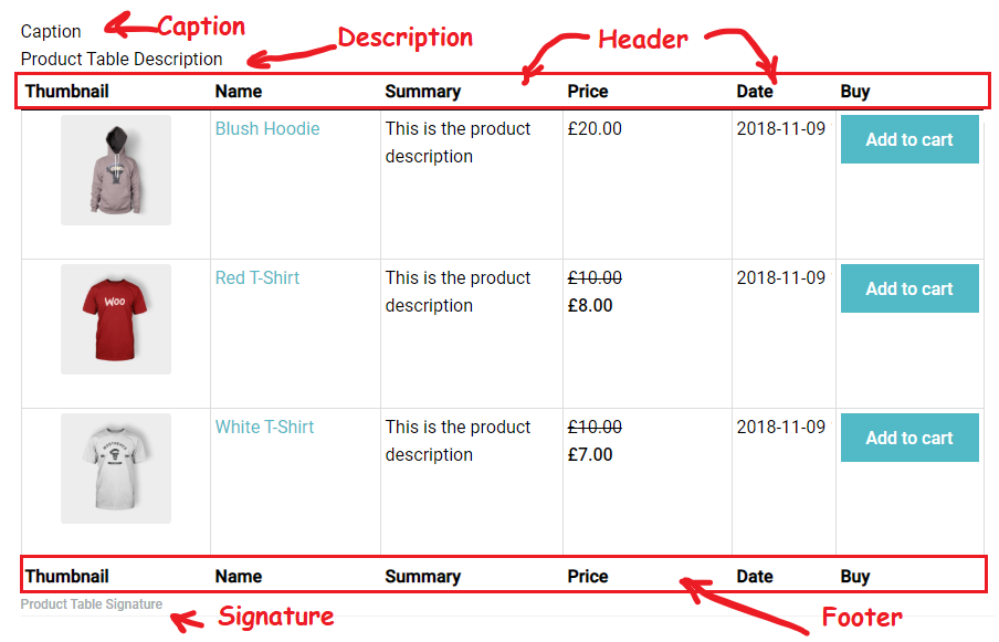
- Caption – the name of the table above the table.
- Description – description of the table between title and table.
- Signature – signature under table footer.
- Header – the table head.
- Footer – the table footer.

Here you can see the appearance of every Table element:
Features in the Settings Tab
WooCommerce Product Table comes with various features and their elements display in the table also.
These Product Table Feature are:
- Responsive Mode – which comes with 4 regimes:
- Standard Responsive mode – in this mode if table content doesn’t fit all columns become under each other with one cell per row.
- Automatic column hiding – in this mode table columns will collapse from right to left if the content does not fit to parent container width.
- Horizontal scroll – scroll bar will be added if table overflows parent container width.
- Disable Responsivity – default table fluid layout.
- Table information – pagination information under table.
- Searching – an instant search by entered keywords and by columns.
- Sorting – dynamic sorting with arrows.
- Pagination – a subdivision of the table by the pages.
- Front-end Export – allows to export Product table in pdf and add a Print button
In WooCommerce Tab on top, you can find a Thumbnail size settings
- Thumbnail size settings – settings for image size to display in the interface.
Here you can see the appearance of every Feature: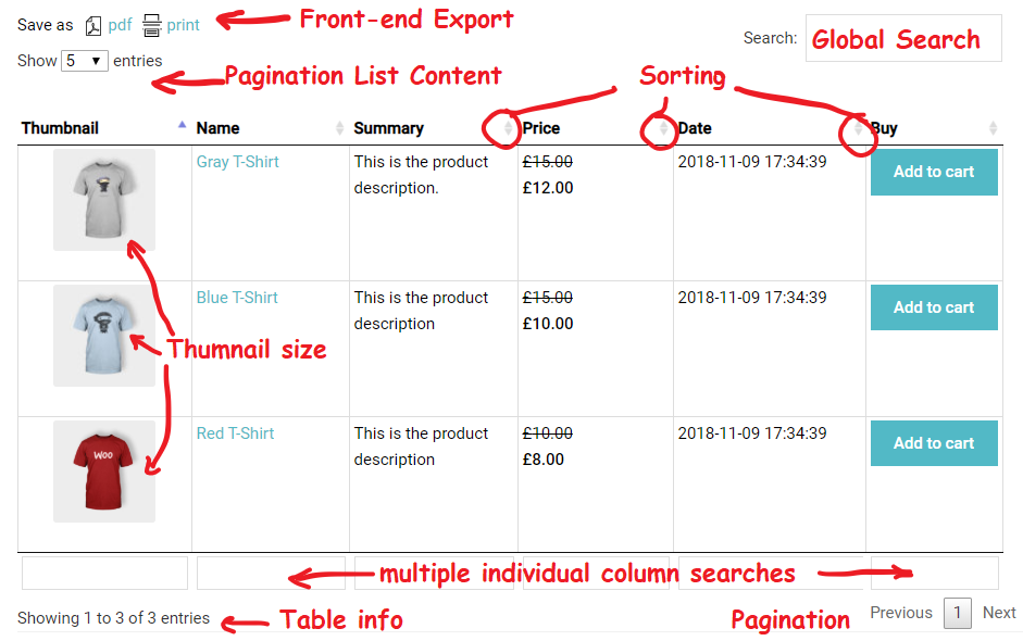
Appearance in the Settings Tab
Here is some more additional settings of the visual style that you can find useful:
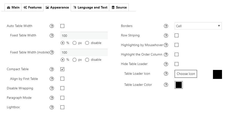
- Auto Table Width – If checked – width of table columns will be calculated automatically for table width 100%.
- Fixed Table Width/ Fixed Table Width (mobile) – Set fixed table width in px or %. Choose “disable” to make the table width adjust by table content.
- Compact Table – decrease the amount of white space in the table.
- Lightbox – add a lightbox to images
- Borders – add borders around a table: cell, row, none.

- Compact – reduce the amount of white space.
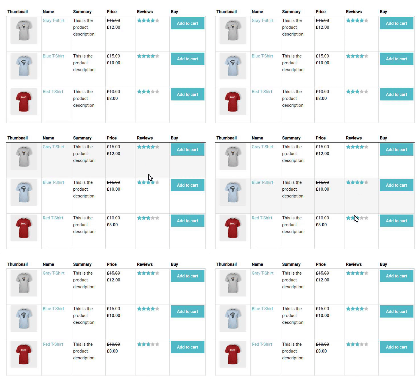
- Highlighting – enable row highlighting on mouse over.
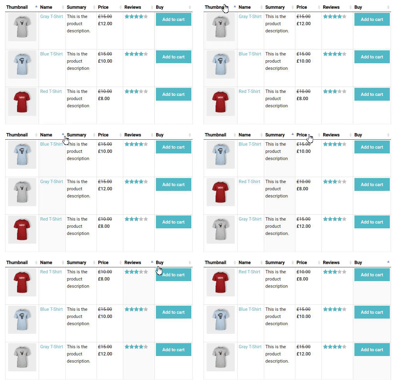
- Highlight the order column – highlight the column that the table data is currently ordered on. Sorting option has to be on.
- Row striping – for example – you use a table, but the table’s rows are difficult to separate visually, especially when there are many columns (or multiple lines to a row) – add row striping to a table, it will display rows background in two similar shades of colour to alternately.

- Hide Table Loader. Enable/disable table loader icon before the table will be completely loaded.
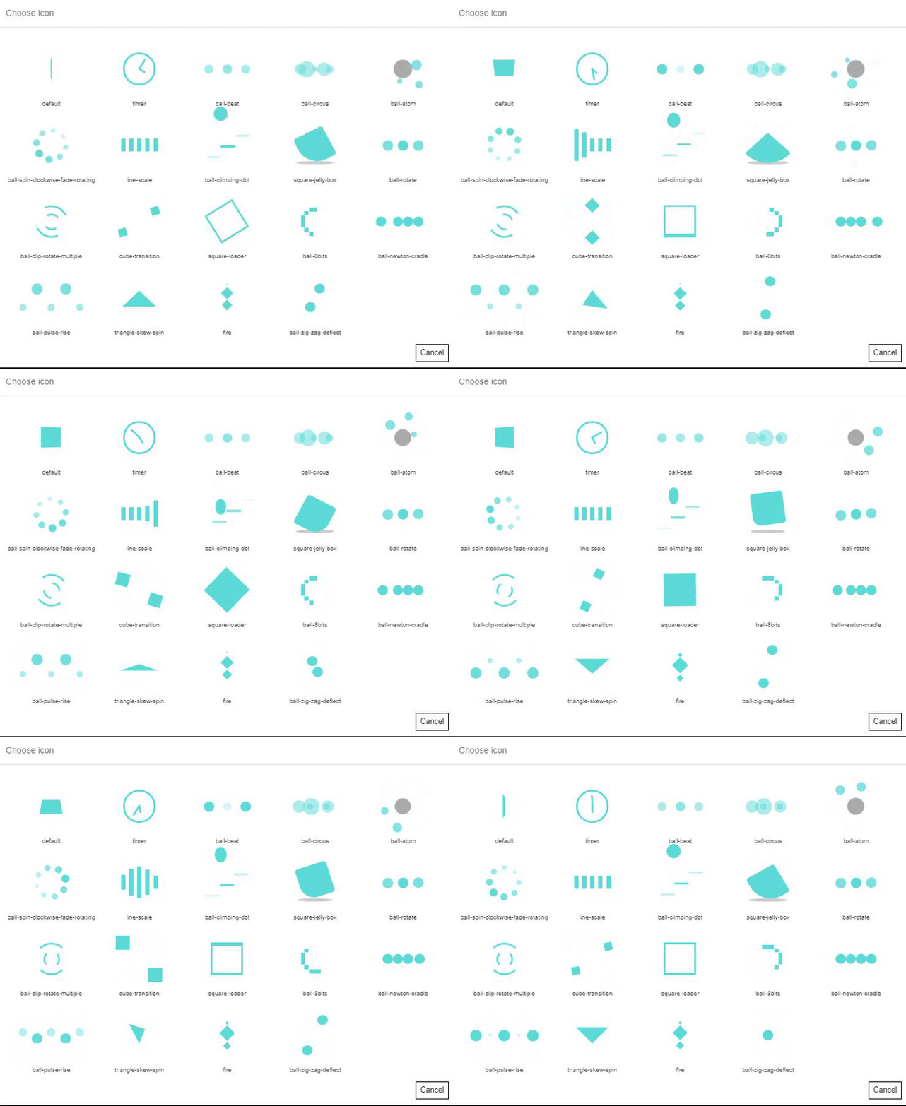
- Table Loader Icon. Choose the icon type for the loader.
- Table Loader Color. Choose any colour for the loader.
Custom table styling in the Appearance tab
Choose your custom table styles below. Any settings you leave blank will default to your theme styles.
Borders external. Set the border colour and width in px: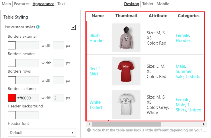
Borders header. Set the colour and width for a header. These settings apply to a header, footer and “search by columns” field. 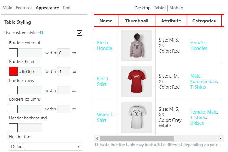
Borders rows 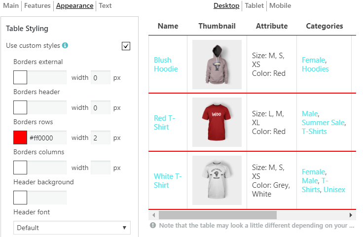
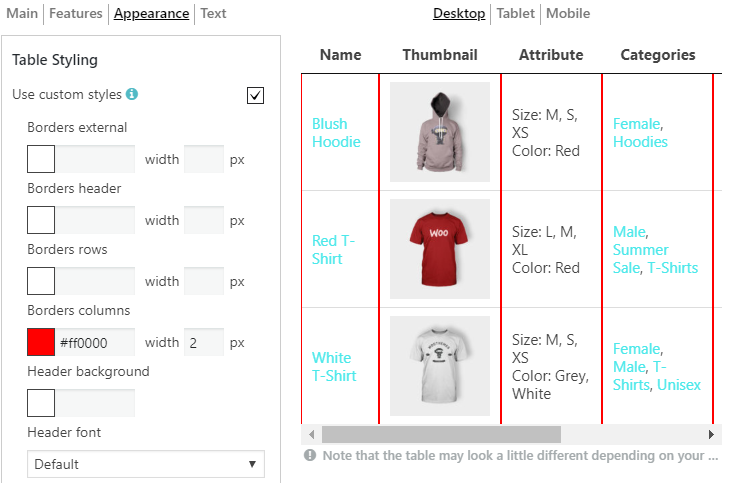
Borders columns
Header background. These settings apply to a header, footer and “search by columns” field. 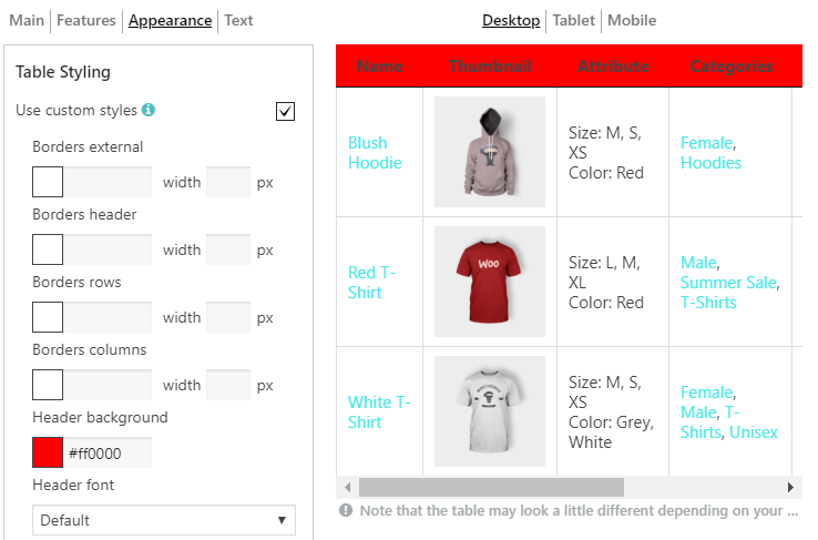
Header Font. Select the font for a header (the same for a footer), font size and colour: 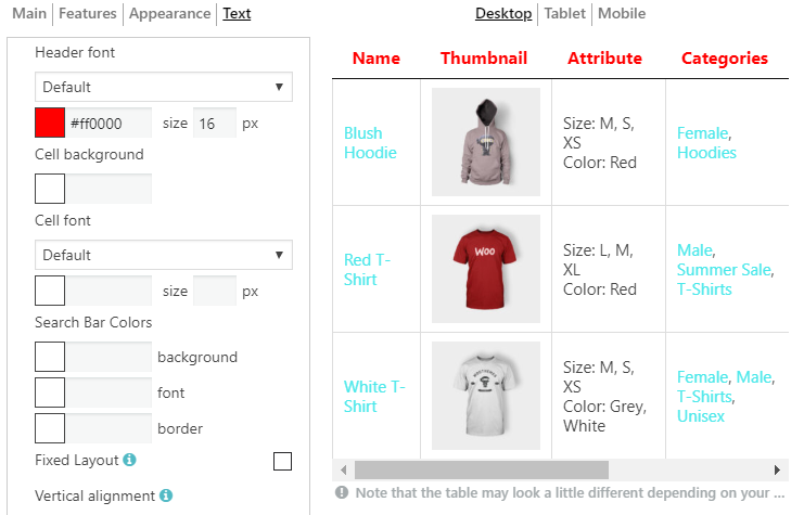
Cell background 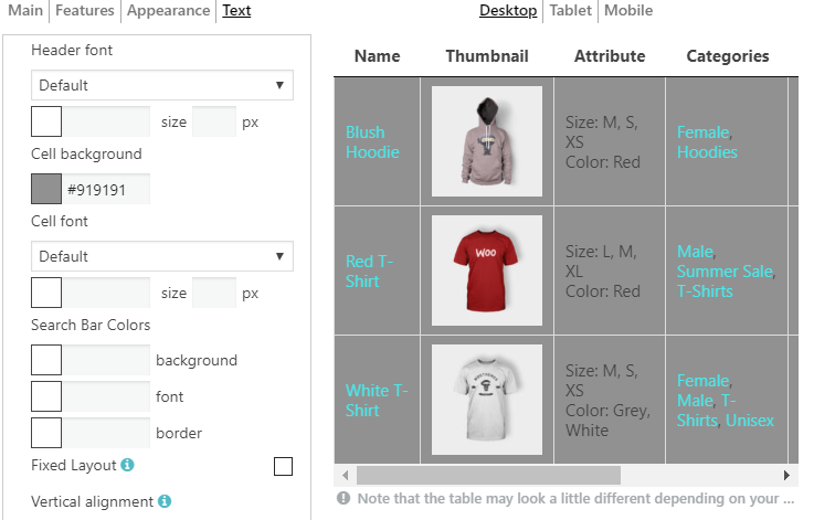
Cell font. Select the font for cells, font size and colour: 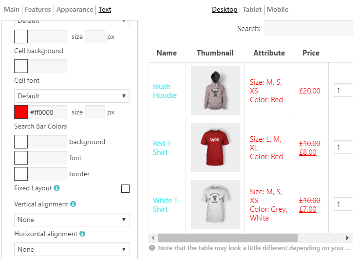
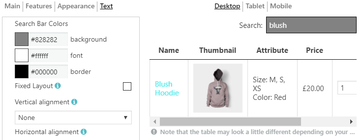
Search Bar Colors. Here you are able to set the colour of background, font and border: 