
Tables never had been really good with responsive design.
Data Tables can be quite wide and sometimes you need them to be like this. Some rows have to be kept together to make sense in a table. You can change the table width, but it can get more and more narrow before start wrapping cells contents, makes it impossible to browsing.
So what happens when a screen is narrower than the minimum width of a data table?
Here could be 2 options:
- You can zoom out and see the full table, but the text size will be too small to read.
- You can zoom into, but browsing the table will require vertical and horizontal scrolling.
It’s not perfect for some tables, especially if they are wide and have lots of columns.
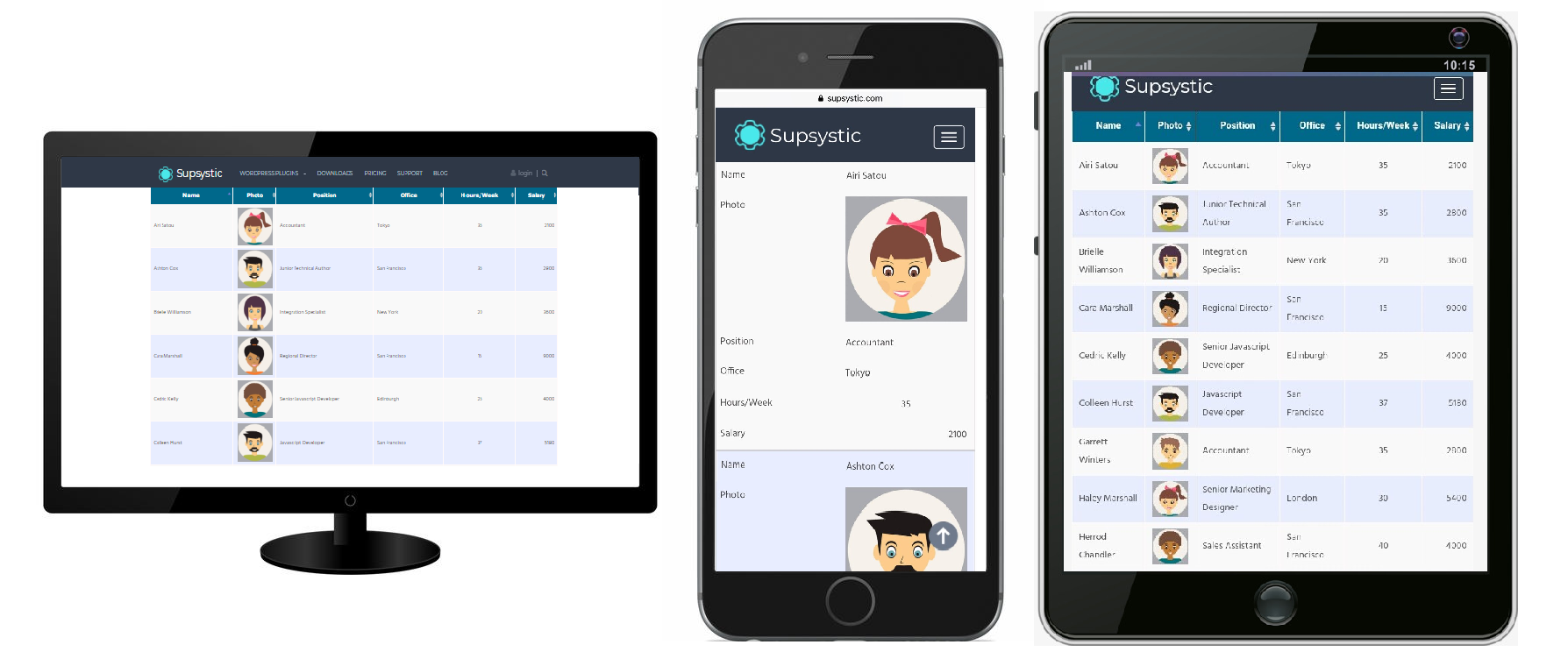
Responsive Modes Feature Of Data Table Generator resolves all problems by optimising the table’s layout for different screen sizes through the dynamic insertion and removal of columns from the table.
Every table is special, and we care about display it perfect on any device.
That’s why Data Tables plugin provides different modes of Responsive design according to your needs and types of table or chart you use.
- Standard Responsive mode – all columns become under each other with one cell per row.
- Automatic column hiding – columns will collapse from right to left. Click on “+” icon and you will see columns that are not fitted.
- Horizontal scroll – scroll bar will be added if table overflows parent container width.
- Disable responsivity – table without responsivity.
Regardless of the mode you choose, be sure it adapts the tables to your screen size in the most convenient way to use and works smoothly on desktop, tablet or smartphone.
It’s great,because some websites are not designed for all devices, users get irritated and never visit that website again.
So, responsive Data Table not only looks good on different devices, but also can be easily changed and can be customized for your requirements!
Here you can look ata video tutorial we made for you: